The user experience is a conglomerate of tasks focused on optimizing a product for effective and enjoyable use. User experience design is the process of developing and improving quality interaction between a user and all facets of a business. User Experience Design is responsible for participating in the research, testing, development, content, and prototyping process to prove quality results. User experience design is, in theory, a non-digital practice (cognitive science) but efficiently used and defined by digital industries.
Introduction to UX planning
The easiest way to approach the planning phase of UX projects is to determine the approach you think should be taken for a project, then examine the constraints and modify the approach based on these constraints. This should allow you to determine quotes and deadlines if your prospect hasn’t provided them to you beforehand. UX projects that are well planned are easier to execute and offer a higher chance of success than those that are managed ad hoc. For designers working in the ever-changing field of user experience, it’s always important to consider fundamental design principles. On many levels, the nature of the work we do is constantly changing and evolving, whether we’re designing for new technologies or different contexts, from apps for personal use to cross-channel experiences. When asked to solve design problems that we haven’t solved before, design principles provide a solid foundation for devising innovative solutions. All these trends have forced us to look at design from a new perspective and propose new interaction models, design patterns and standards, many of which are still evolving.
Visual design trends change too, sometimes for the better; sometimes not. For example, in the recent past, we saw the predominant use of small, light gray fonts that were too small and too low in contrast for good readability, for almost anyone, not just those with severe vision impairments. We are now seeing larger fonts, solving that readability problem. The UX Design Principles course provides entry-level skills for those interested in or working in user experience design. The workshop covers aspects of design for the web, applications and mobile devices. This UX workshop is suitable for designers, business analysts, product managers, and developers. No prior UX or design experience is required. It serves as the foundation for the UX Classes as well as the UX Certificate program at the American Graphics Institute.
What is user interface design?
User Interface Design is its complement, appearance, presentation and interactivity of a product. But just like UX, you’re easily and frequently confused by industries that employ UI designers. User interface design (UID) or user interface engineering is the design of websites, computers, home appliances, machines, mobile communication devices, and software applications with the focus on user experience and interaction. User interface design is closer to what we call graphic design, although the responsibilities are somewhat more complex. Human-Computer Interaction (HCI) integrates concepts and methods from computer science, design, and psychology to create interfaces that are accessible, easy-to-use, and efficient. There are three factors that must be considered for the design of a successful user interface; development factors, visibility factors and acceptance factors. Developmental factors help improve visual communication. These include: platform limitations, toolkits and component libraries, support for rapid prototyping, and customization. Visibility factors take human factors into account and express a strong visual identity. These include human skills, product identity, clear conceptual model, and multiple representations. An installed base, corporate policy, international markets, and documentation and training are included as acceptance factors. There are three fundamental principles involved in the use of visible language.
Do’s and Don’ts of UI and UX Design
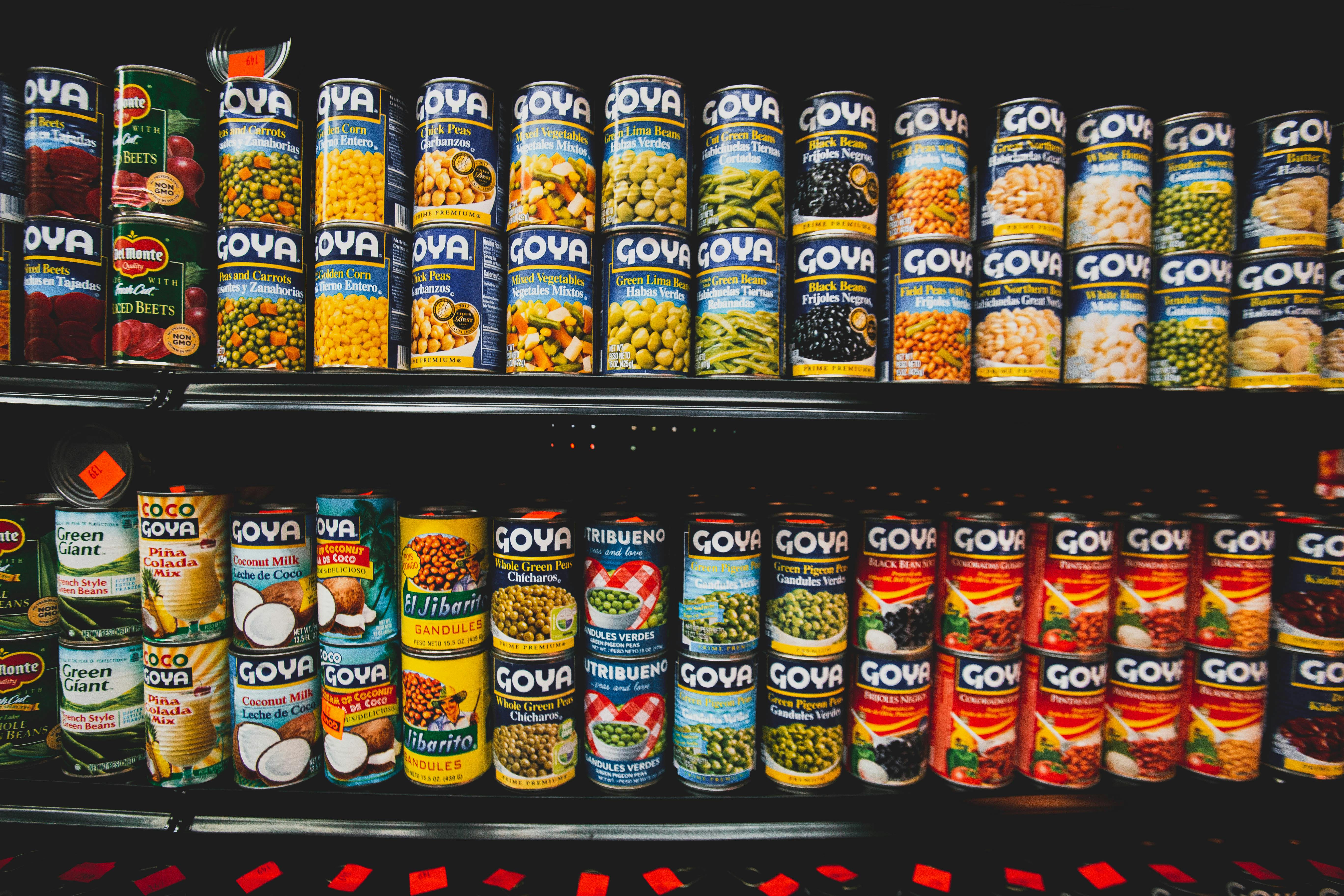
The online user experience is very similar to the user experience you get when you go to a grocery store. You want to have a nice time without any hassle. You want to be able to quickly navigate the store, get what you need right away, head to the checkout line without waiting, and go home. You don’t want to deal with a slow ATM, items not where they should be or out of stock, unfriendly employees, or a crowded parking lot. He just wants what he came for (groceries) and be on his way. Stores understand this and have invested a considerable amount of time and money to help you navigate the store more easily, make sure the items you want are in stock, and provide fast and friendly checkout lines. It might seem a bit corny to think of UX design in terms of going to your local grocery store, but the experiences are similar. Our customers are visitors to the sites we build, and edibles are the content they came to the site for. For those of us who go to the store, it’s easy for us to point out the things that irritate us or think need to be improved. However, when it comes to our own designs and user interfaces and the creation of them, we may not be able to flag these irritants before the users do. We can fix this by taking a step back and looking for these weak points in our design, so as not to cause them unnecessary frustration and keep them on our site so they can access the content they were looking for. To help us designers take a step back and look at our designs and user interfaces through the eyes of the visitor, let’s go over some do’s and don’ts of looking out for so we can help them get exactly what they were looking for without irritation or misunderstanding. UX.
1. YES: Provide a similar experience regardless of device Visitors come to your site using many different types of devices. They can visit your site on their desktop or laptop computer, tablet, phone, music player, game console, or even on their watches. A big part of user experience design is ensuring that no matter how a visitor views your site, they get the same experience they would if they were visiting it from another device. This means that if a visitor is viewing your site on their phone, they should still be able to find everything they need just as they would if they were viewing your site on their desktop at home. A seamless experience across all your devices helps keep your users on your site, no matter what device they’re using.
2. YES: Provide instantly recognizable and easy-to-use navigation The key to providing a pleasant user experience for users is understanding that they are looking for content. They want information that you are providing on your site. The way they get there is by using your site’s navigation to quickly get to the content they’re looking for. Provide a user-friendly navigation system that is easy to recognize and easy to use. Design your navigation in a way that takes visitors where they want to go with as few clicks as possible while still being easy to scan and locate where they need to go.
3. DON’T: Allow site design to hinder site readability A site’s design or user interface should never interfere with the user’s ability to consume the content on the screen. This includes having busy backgrounds behind the content or poor color schemes that make the site difficult to read. Busy backgrounds are distracting and take attention away from the content, even more so if the busy background is directly below the content. Also, be careful not to use color schemes that diminish the contrast of the typeface on screen (ie, light gray type against a white background). Focus on your site’s typography to ensure that issues like line length, line height, kerning, and font choice don’t present readability issues.
4. DON’T: Hinder a visitor’s ability to scan the screen As I mentioned earlier, users and visitors often quickly scan the screen before settling in to read anything in particular carefully. Users often look for visual cues like headers, images, buttons, and blocks to know where to focus their attention. If you start removing these elements, users will find it difficult to scan your content to find what they are looking for. Using appropriate headers that are easy to see, images to illustrate points, navigation buttons, and blocks of content that are unique or important help users scan the screen to find what they need.